Health Non-Profit Redesign
Client
National non-profit organization focusing on health education, research, and advocacy. Their website receives about 42 million views a year
Scope
Full redesign and restructure of their site
Role
Lead UX designer for the project, working with other members of the team - UX, UI, BA, PM, QA, SEO, analytics, and development
UX Deliverables
Sitemap, annotated mobile and desktop wireframes
Research
Stakeholder Interviews
To kick off our project, I conducted interviews with over 20 client stakeholders across the Advocacy, Health Promotion, Research, and Development and Fundraising teams to get a holistic sense of the goals for the future site and the pain points they and their users had with the current website.
From talking to the stakeholders, it was clear that there were a lot of passionate people at the organization, and we wanted to that to show in the website. Many people brought up how important the community and engagement aspects were, and really wanted to use the website to help build a community.
I would really love us to try and build the site to be conducive to this entire engagement pyramid that really brings people in. We also need to figure out a way to get people to engage with us online and then take them offline.
We hear that a lot of patients come to [our site] because they’re looking for the sisterhood that breast cancer patients have. So if we could make them feel like they’re part of something bigger, it would be incredibly meaningful, and it would keep them coming back to us."
When they come to us, they aren’t coming to us with the goal of 'Boy, I want to fundraise', they’re coming for help and information and a connection. That’s where it’s our job to build our relationship with them. That’s where it’s our job to take them from more than just an online viewer, helping them help other people just like them."
As a non-profit organization, in order to fund research, advocacy, and education initiatives, another goal of the site was to encourage donations from users.
We need them to share their story, but we also need them to donate to us."
Capturing people’s information so that we can continue to talk to them, that’s huge. And we also need donations."
When discussing pain points, the top themes that came up were that the website was not properly highlighting opportunities for people to get involved, users were having difficulty finding content, and that the site looked “busy” and “flat” and didn’t properly communicate the mission and message.
I get very frustrated on the site when I can’t find what I’m looking for within a few clicks. So making sure that the site is nimble and intuitive."
It should be easier for patients to get access to all of the resources they want and also able to find things like a walk near them, a place to share their story, a place to make a donation."
When people go to the website, they’re like, ‘Where’s the research program?’
I’ve always found that its usually on our website if you want it, but the finding it is a challenge."
It seems like there are three separate clicks to even get to find out about our events and on our events page where you go to get involved.
User Personas
The client was able to provide us some robust past persona information, so I built on top of that and created the following proto-personas. The main personas were around people diagnosed and living with cancer or other diseases, and their caregivers. Beyond that, there were also personas around those with sick family members who want to learn more information, fund raise, and donate.
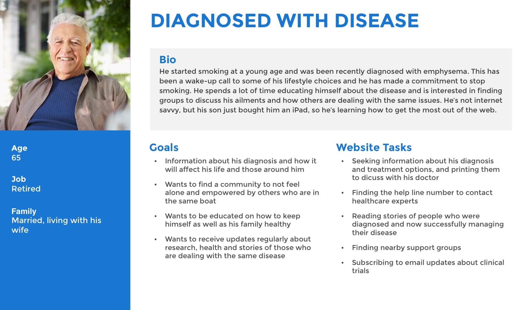
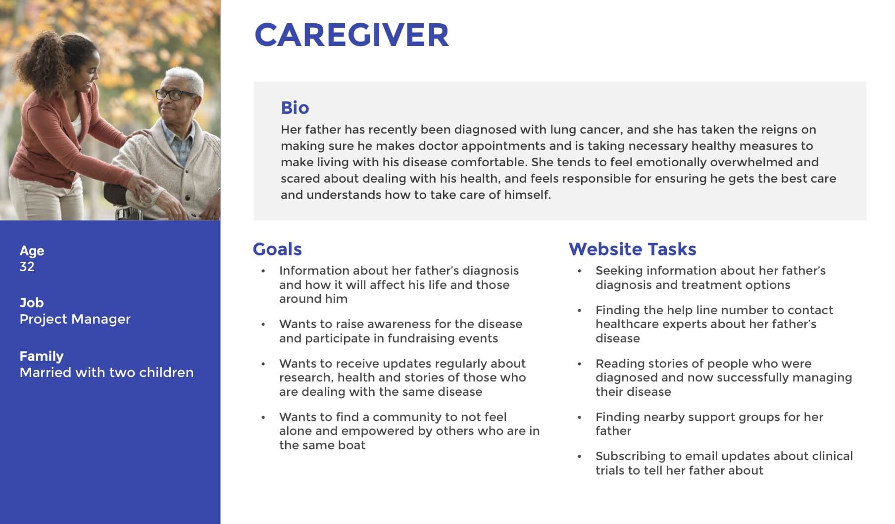
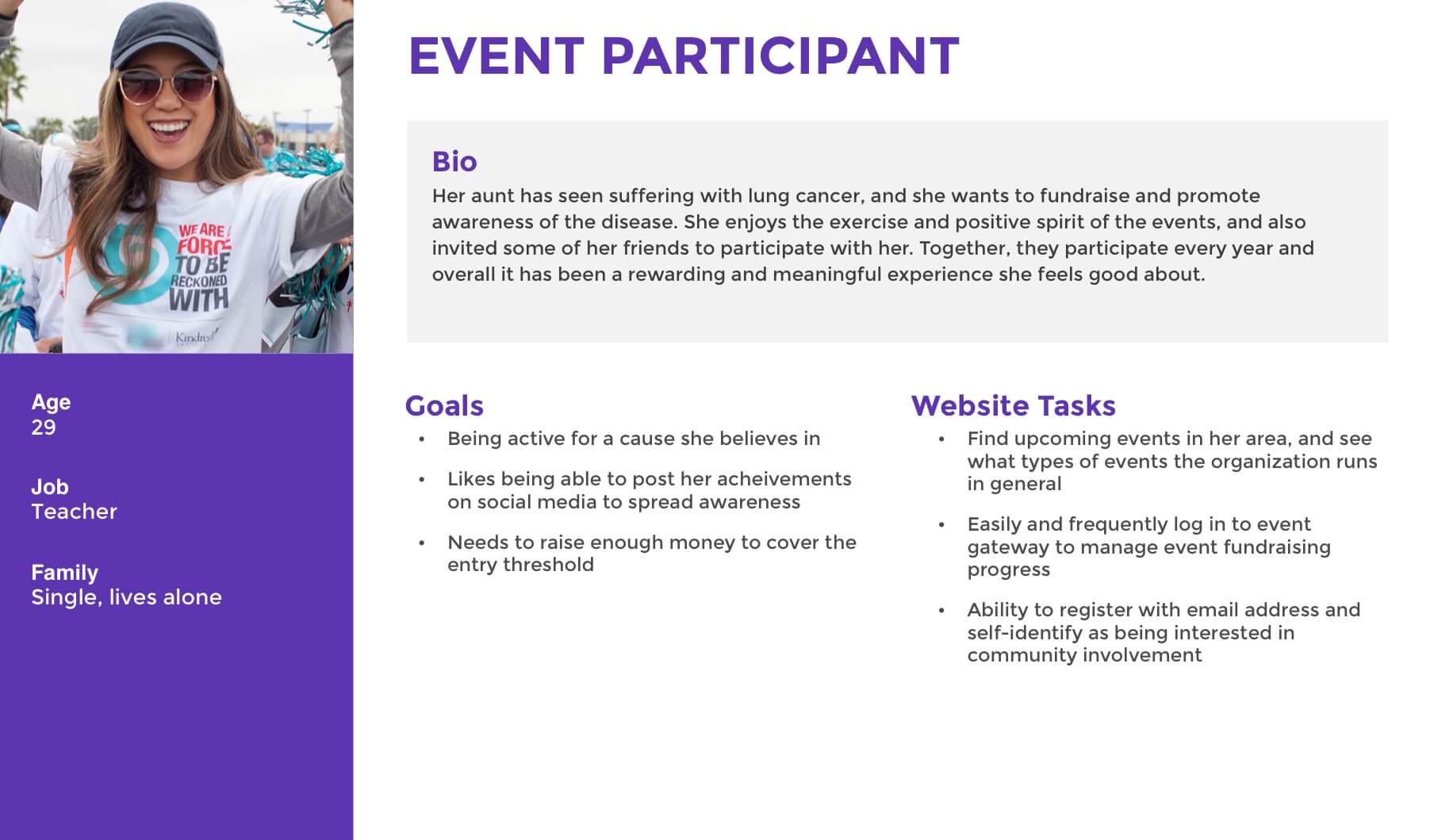
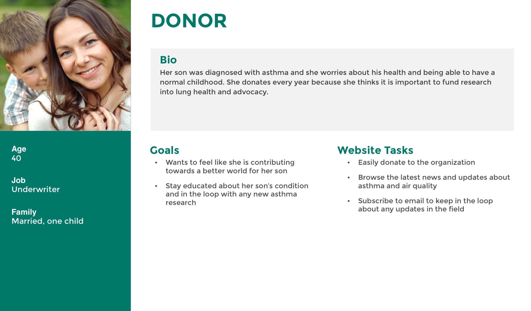
The largest takeaway was that there are a variety of users coming to this site, and that many of them are dealing with serious, and possibly life-threatening health issues, including cancer. These can be very emotionally difficult circumstances where people are scared and distraught so we wanted to provide a sense of positivity, community, and hope wherever possible.
Overall goals to solve for through the redesign:
- Make finding site content easier
- Create a sense of community and support
- Encourage users to donate
- Encourage users to participate in events
Ideate and Design
Sitemap and Navigation
Whenever there are complaints about users not being able to find content, that is a sign that site navigation needs to change. Users typically can’t pinpoint why they’re having trouble finding things, but in my experience, it is almost always a navigational issue. We did a fairly significant overhaul of site structure for this project, but there were two main points that I believe helped navigation the most.
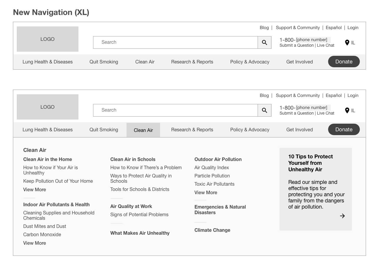
We added mega-menus to desktop (and revealed sub-levels on mobile). This means that users can better visualize site architecture and reduces the number of clicks it takes to get to a variety of pages.
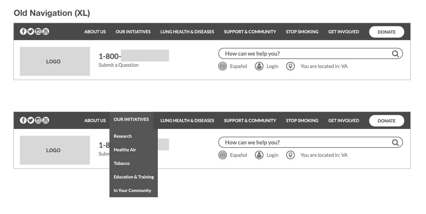
There was a navigation item called “Our Initiatives” with several elements below it- Research, Healthy Air, Tobacco, and others. Because it was phrased as more of “look what we do” rather than “look what we can offer you” users were not being drawn in to a lot of very valuable and relevant content. In the new sitemap and navigation we moved those to the main navigation to give them the attention they deserve, rather than hiding them within sub-levels.
Additionally, with “About Us” being the first navigation item in the old nav, and in left-to-right reading cultures that means that it will be the first item users see, and will influence how they perceive the site’s offerings. (This can be illustrated with the following psychological study conducted by Asch:
Person A is intelligent, industrious, impulsive, critical, stubborn, envious.
Person B is envious, stubborn, critical, impulsive, industrious, intelligent.
Participants ranked Person A more positively, simply because the first traits listed made the biggest impression.)
This adds to the sense that the navigation was not very user-centered, and why typically “About Us” is found further right in navigation. After discussing this with the client, they agreed to completely remove “About Us” from the navigation and add it to the footer instead.
Despite a deceptively few amount of nav items, the site had a massive amount of content and resources available. When building out the sitemap, it became very clear why users and stakeholders alike were having issues locating pages: the navigation did not reflect the information architecture of the site well at all.
Within the sitemap, there were a lot of pages to inventory. As part of the sitemapping exercise for the project, I mapped out the entire site structure within LucidChart and discussed the proposed changes with the client. We renamed some categories while consulting with the SEO team to make sure it had maximum impact for UX and SEO. The sitemap became a valuable document for the SEO and development teams as they went through site migration tasks as well, and we could refer to it as a source of truth.


After some input from our client we landed on the following designs for navigation. (Phone number and logos have been removed.)
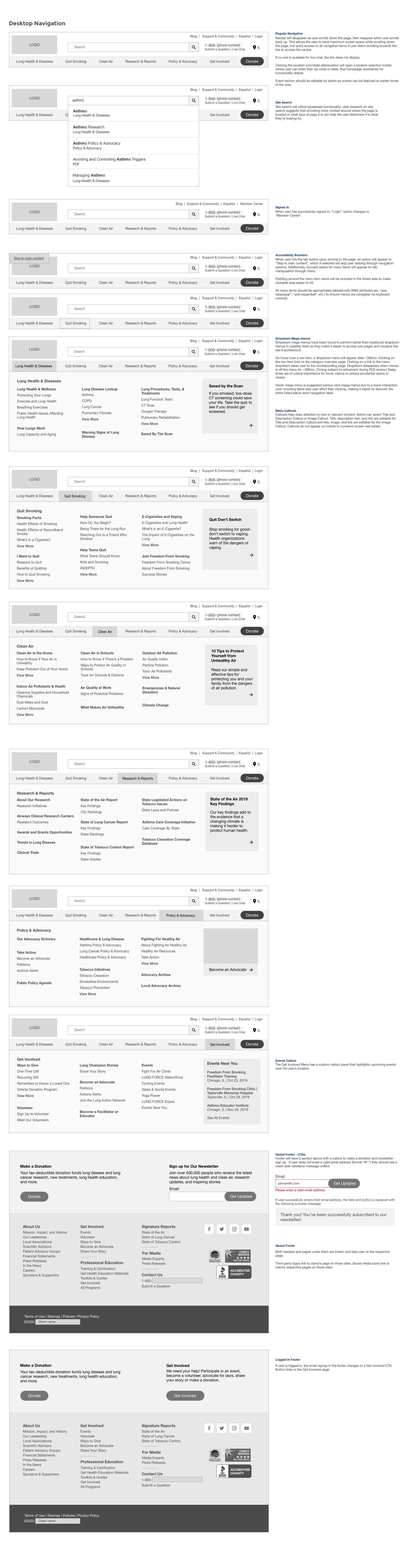
After launch, we received some feedback that there were some users that thought the “Submit a Question” link to the right of the search box was the way to execute the search, and weren’t sure that the phone number was for the help line. Based on that feedback, I created the following options to address the issues.


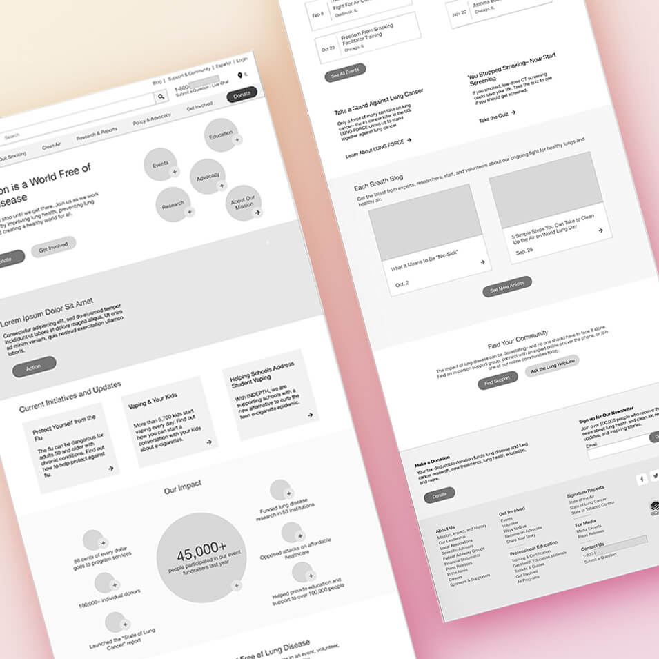
Homepage
The homepage had a lot of different goals to balance, but after discussing with the client we decided to go with a concept that really highlights the organization as a champion for health, and lead with the mission while encouraging users to donate and get involved.
My initial concept, brainstormed with my team during a whiteboarding session, involved leading with the stories of people involved with each facet of the organization to build a sense of community and belonging immediately upon landing on the homepage, but the client decided to repurpose the concept to reflect different branches.
Beyond that, we followed the guidelines provided by NNgroup for non-profit sites concerned about receiving donations. The number one recommendation is to clearly explain what the organization does; while the old homepage did clearly state the mission, it was further down the homepage and overshadowed by many other elements. In our new homepage, we led with the mission right in the hero section.
Their second recommendation was to disclose how donations are used, which is also featured prominently on our new homepage. It lists the percentage that goes directly to program services, which is an important metric to donors.
See along the left side of the wireframes for more insight on the thought behind the design. Mobile designs can be found under “Example Deliverables” in the Results section below.

The Biggest Challenge
The biggest challenge for this project was that we had a limited scope based on the client budget. This resulted in only going through the full design process for 7 templates. That was my main struggle for this project: how to make the most impact with a lean scope. As a UX designer, my job is to create the best experience for visitors to the site, but as an agency employee I have to work within the contracts provided.
In the end, I think we managed to provide a good amount of value to the client based on the scope provided. Of course, I would have loved to do usability testing and get more feedback about design choices, but that was not included as part of the project plan.
Results
Post-Launch Stats
Site Awards
Best Non-Profit Website - 2020 WebAwards
Outstanding Healthcare Website - 2020 WebAwards
Gold Award, Nonprofit Website - 2020 dotCOMM Awards
Gold Award, Nonprofit Website - Hermes Creative Awards
Example Deliverables
